Parks Pass

“America the Beautiful” is an interagency pass that grants access to federal lands across the country. We wanted to let site users know that it exists, both as a general piece of information and when users are looking into visiting a specific location that requires an entry fee that can be waived with the pass. The interagency pass is available for purchase by anyone, but some groups, such as seniors, military, and 5th grade students, are eligible for free or discounted passes. We created ways to purchase the pass, as well as enter a pass number while booking a campsite for a discount (if the site provides a discount for that type of pass).

In addition to the interagency annual pass, some locations have site-specific digital passes that are good for a day, week, or a year. These are also available for purchase on Recreation.gov and sent to customers for activation and use at a later date.

For this Passes micro-service, I acted as both UX designer and product manager. To create a useful and accurate framework with full client buy-in, I held a weekly Subject Matter Expert (SME) meeting and invited representatives from all the major agencies. Throughout the week, I would collect questions my team encountered and enter them into a Jira Confluence page. At the weekly SME meeting, I showed an agenda of the meeting topics, went through the proposed design/framework, asked questions, wrote down new questions, created action items, and assigned action items to people present. People in the meeting had access to the Confluence page and could reference any past meeting to see questions, answers, and links to designs.

This micro-service was my only customer-facing project, and can be seen on Recreation.gov.

Reports

Reports are a big deal in our client agencies. They allow people working at a site to know who should be there (and who shouldn’t be there), as well as provide visibility and accountability for managers into the operations of a site or region. Because reports are so important, over 100 of them were in use across our client agencies. Many of the different reports served a common purpose and had largely overlapping information, so we believed that we could combine many of the reports and create about two dozen reports that would serve our customers better. We also needed to set rules on who could access reports, as well as create ways to automatically send the reports. Some sites need a daily report sent by email or fax (or hand delivered as there is no internet connectivity), and users often needs to translate field notes into reports to send to management.

For this Reports micro-service, I acted as both UX designer and product manager. To create a useful and accurate framework with full client buy-in, I held a weekly Subject Matter Expert (SME) meeting and invited representatives from all the major agencies. Throughout the week, I would collect questions my team encountered and enter them into a Jira Confluence page. At the weekly SME meeting, I showed an agenda of the meeting topics, went through the proposed design/framework, asked questions, wrote down new questions, created action items, and assigned action items to people present. People in the meeting had access to the Confluence page and could reference any past meeting to see questions, answers, and links to designs.

Our team successfully created a page to create reports on demand, as well as to automatically generate reports and have them sent to an organizational inbox, individual, or roles at a location. Users are able to choose from a list of instantly available reports, or select users are able to choose the data to create highly-customized reports.

Internal Accounts

A major undertaking for Recreation.gov was to create a common set of user roles that could manage federal lands and employees. These roles had to be common across twelve unique agencies yet fit into a small number of categories to make administration of the site manageable.

For this Internal Accounts micro-service, I acted as both UX designer and product manager. To create a useful and accurate framework with full client buy-in, I held a weekly Subject Matter Expert (SME) meeting and invited representatives from all the major agencies. Throughout the week, I would collect questions my team encountered and enter them into a Jira Confluence page. At the weekly SME meeting, I showed an agenda of the meeting topics, went through the proposed design/framework, asked questions, wrote down new questions, created action items, and assigned action items to people present. People in the meeting had access to the Confluence page and could reference any past meeting to see questions, answers, and links to designs.

With this system in place to create content, I set about designing a way to:

  • create and manage an account for yourself (including emails, passwords, contact info, etc.)

  • create and manage an account for someone working at a site you own

  • set limits of access for seasonal workers

  • place a site within a hierarchy of regions/districts, parks/forests, and down to individual campgrounds

  • allow managerial access to a distinct combination of sites/employees that may or may not fit into clear hierarchies

There was a user interface that we designed, developed, and iterated upon for months, but the brunt of the work for me was mostly in coordinating with SMEs to create rulesets for the developers to implement.

Emotions Research and Medical Devices

During my time at UEGroup, my main project was the aerospace maintenance tool redesign, and I also worked on tools for the physical security of buildings for two different companies. In addition to these main projects, I contributed in small ways to a few medical device design projects (such as brainstorming interactions and note-taking for a research project). The other big project I completed was a new feature for an existing tool that usability researchers can use to measure the emotional reactions of participants.

The existing tool measures the type of emotion and degree the participant feels that emotion. The lead researcher in charge of the tool had experience during research sessions that sometimes participants felt more than one emotion, but the order they felt the emotions in did not dictate which was the dominant emotion, making it necessary to ask participants explicitly how intense the emotions are and which is the dominant emotion.

The design of this tool needed to fit on mobile, tablet, and desktop-sized screens and allow for both touch and mouse/keyboard. The tool is intended for audiences in many nations, so words needed to be kept to a minimum to avoid translation difficulties — this meant the design had to explain the interactions with little to no instructions. Through creating many different designs and getting feedback from my fellow designers, we found a design and set of interactions that allow the user to discover the needed inputs on their own and easily provide good data to the researcher.

Building Physical Security Management

I was the lead designer on a project tasked with reimagining the interactions for a software tool that controls the cameras, remote door locks, and personnel entry records for a building. The existing tool had evolved to incorporate new features and the interactions to manage and access their different kinds of data felt disjointed and unintuitive.

To redesign the tool, I focused on who would use the features and when they would use them. The vast majority of the tool’s use would be by security guards monitoring the building and occasionally clicking into a feed to focus on the data or video. Far less often, a security manager would setup the interactions of which data appeared on the building map, and they would not be concerned with the feeds occuring while they setup the controls. With this perspective in mind, I convinced the client to let go of a small managerial settings window that shared the screen with live feeds to allow the entire screen to be devoted to the task at hand of customizing the tool for that building.

The next important change was to move away from distinct interactions for every type of data and create a common set of interactions that would lead to any possible feature in the software. The original software had distinct starting points for every feature but the new design had a single starting point for customization and followed a narrowing path until the user found the desired capability. This narrowing path design was influenced by the Mac finder window where selecting from a left-side vertical list at each level of choice will use the right side of the window to highlight the selected item and, in this case, perform the work of customization.

After several rounds of feedback from my fellow designers and the client’s product owner and engineer, I worked with a visual designer to create a visual language, polished look and feel, and deliver pixel-perfect final designs and assets to the client.

Next-Generation Aircraft Maintenance and Logistics Software Redesign

Key takeways:

  • Start with discovery research. As the client tells you about the need, you’re going to start designing something in your head. When you see the current product, you’re going to start designing something in your head. When you have your first user interview, you’re going to start designing something in your head. Do all the contextual discovery research you can before you start the design.

  • Start with a small, end-to-end feature. This tool is big. It does so many things. It would be impossible to redesign it all at once, so we started small and chose two feature that had a distinct workflow within the larger system. This allowed us to prove the viability of our approach and design to the client, as well as gain insights into the larger workings of the system to make the redesign of the entire system easier.

  • Research early and often. I love when a project has the time and access to users to allow for several rounds of usability testing at key decision points in the design. We showed users low-fidelity wires, high-fidelity mockups, a fully interactive prototype, and learned important things at every step that changed the design for the better.

UEGroup was hired to redesign an existing software tool that tracks and enables the maintenance and logistics supply chain for a high-tech, next-generation military aircraft. Every part on this aircraft must be tracked, including engine hours, flight hours, takeoffs and landings, and using weapons. To accomplish this, all parts are tracked not only by part number but also with a manufacturer's code and serial number for that unique part. All parts have unique requirements for when they must be inspected and replaced, and the system lets the maintenance crew know when that should happen. All maintenance actions must be tracked in the system and the system must approve of all actions and parts before the aircraft can be released for flight. To add one final complication, this aircraft is sold to many nations which all have a unique terminology and requirements for what makes and aircraft ready to fly.

The existing software meets all of the above requirements, but is considered to be a hindrance rather than a helper. UEGroup requested to do a complete redesign rather than modify the current tool. The redesign began with extensive discovery research and visiting the people who use the current tool. Our discovery research tracked what the different maintenance and logistics specialists do on a daily basis, as well as periodic long-term requirements. We charted what happens in the physical world, in the software, and on paper. We tracked the flow of information and authority from start to finish and created diagrams to map both what happens today with the current software and what essentials would need to happen in a world agnostic of the current software.

Armed with a thorough understanding of what information, roles, and authorities are needed, we moved into the design phase. We created several initial possible designs that were intentionally very different. After discussing the pros and cons of the designs, we narrowed in a main design but kept a record of the other designs to use at later points when we faced specific interactions that needed special treatment. We conducted several rounds of usability testing with users of the current system. The participants represented as many demographics of the user base as we could find. The initial usability tests asked participants how they would complete tasks with our designs, what they expected to happen if they clicked certain icons, where they expected to find certain pieces of information, and how they liked the new design.

Several rounds of usability testing helped us refine our concept enough to invest in an interactive prototype that would allow us to perform a final round of in-depth usability testing where the participants had enormous freedom to use the software however they wanted. For this final round of usability testing, we wrote a testing plan that included tasks, measured time, and asked questions about what was expected and how the participants like the design. When we performed the actual test, participants found the prototype so intuitive and easy to use that many participants broke our test plan by jumping in and using the tool as they really would, not allowing us to time ask questions as they went. Participants not only used the tool, they enjoyed using it and were thrilled with the new direction of the tool. Their satisfaction is why this was the project I am most proud of in my career as a UX designer.

Fidelity - Margin and Options Accounts View Page

I conducted five rounds of "guerrilla usability testing" to find the best design for the margin and options accounts view page. This was a difficult page to design because the margin eligibility rules are complicated (only one account per ownership type can have margin), and a traditional presentation of accounts would confuse users who did not understand the rules. Across all five rounds of testing I asked users to complete simple tasks like "Can you tell me which accounts have margin enabled?" and "How would you get margin on this account?" 

The earliest designs tried to show the margin rules in the user interface with forcing functions like dropdowns and radio buttons. This made sense to a room of designers, but participants in usability tests found it confusing. Next I tried a design similar to the other view pages my team members were building, but these overly simple pages combined too much information. The final design created more columns and used longer calls to action than other "standard" designs being created in my group, but made the information users needed explicitly clear and easy to understand. When I asked users questions like "Can you tell me which accounts have margin enabled" and "How would you get margin on this account," participants found the tasks so easy that they wondered if it was a trick question -- a great change from the earliest designs when users couldn't complete the tasks! To deviate from the standard I had to prove that the standard design was less usable than a new design. One non-standard design was the call to action on accounts ineligible for margin. Rather than labeling the link "disabled" or "ineligible" and explaining why somewhere else on the page (which discourages interaction), I labeled the action as "How to enable margin on this account," which brings up a layover that explains the margin rules and how they affect this account. 

I also had the opportunity to show my development team in Bangalore, India how I conduct usability testing so they could learn the value of UX. I showed my team my current prototype and asked them how they thought people would interact with it. We then brought in engineers from other teams and had them complete a few tasks. They got to see that we all predicted people would interact with it one way, but users interacted in other ways and questioned things we thought were simple. This helped them see that UX design is an iterative process, and sometimes we have to throw out the current design and find a better one.

Fidelity - Change of Address

The change of address should have been pretty straightforward, except that at Fidelity each account can have a separate address and people can have seasonal addresses. I created multiple versions trying to show accounts with addresses other than the main address. Usability testing between the top choices showed no real difference in performance or preference, so we made the decision about which decision to implement largely based on which best kept in line with the Fidelity visual design standards.

The second image here shows the Axure menu on the left. To coordinate with product management, development, content strategy, and other stakeholders, I created a "UI single source of truth" that was always the most current place to find any version of the page, including different user types, scenarios, visual design specs, and paths to this page. I gave my team one link to the shared drive at the beginning of the project and continually added and updated to the content at that link, but the link never changed. This "UI single source of truth" worked so well that I've used it in every large project since.

Earth.io

The Earth.io app was a prototype created to show the proof of concept for an investing app designed to show investors the potential future product and gain funding to create a working product. I was the UX and UI designer of this app, so this shows my visual design skills when not working with a visual designer.

I met a fellow Babson MBA student shortly before moving from Boston to Denver and had free time during my days in Denver while searching for a UX job, so I took on the role of designer for this startup to keep my UX skills up.

The purpose of the app is to use spare-change investing (if you make a purchase of $5.40, the app rounds up to $6.00 and invests $0.60 automatically) to invest in environmentally-friendly ventures, such as geothermal energy, solar panels, and organic farms.

The app has two main sections: Stories and Portfolio.

Stories is modeled after Instagram and allows users to scroll through potential investments to see where they would like to put their money. The user could be drawn in my images of farms or stories of schools. Next to each story, the user sees if they are invested in this project and, if they aren’t, they can invest automatically with a single click. As projects progress, bondholders will post their Impact so users can see the good coming from their investments.

Portfolio shows the user their portfolio mix, dividend schedule, account value, and whether or not users are pulling in additional funds from an outside source (like a checking account) to add to their spare-change investing.

Click here to see the InVision prototype.

Stories.jpg
3.2-Impact_3.jpg
2.1-Portfolio_Invested.jpg


Fidelity Portfolio

I worked in the Fidelity Investments User Experience Design (UXD) group from July 2015 - March 2017. Seeing a large, mature design group in action taught me about process and procedure. I was a design lead for seven projects spanning three scrum teams. For each project, I worked with business partners and developers to scope the requirements and goals, draft a wireframe, conduct usability testing, and provide visual design specs that work with Fidelity's web components. 

My process for each project began with digging into the need for each project. My group within UXD focused on modernizing the customer experience and reducing the volume of calls coming into our customer support centers, so the "why" was usually connected to that. With an understanding of both the business and the customer needs, my next step was to create early-stage wireframes to confirm with business partners that I was on track to solve business and customer problems. These early designs didn't show "how" we would solve the problem, only confirm that we were solving the right problem. 

To learn which specific design is the most usable, I created many designs, showed them to other designers to see which were the best, and tested those for usability. Projects required as few as one round of usability testing or as many as five rounds to find the best design solution. My favorite way to conduct usability testing was "guerilla testing" where I took a prototype to Fidelity's cafe during lunch and would ask people walking by to spend a few minutes completing a handful of tasks on my prototype. I liked conducting usability testing myself because I could see exactly when people became confused and learn exactly what they expected to happen. I often came up with the next version of the design as I sat there and talked to participants. Finally, I would create visual design specs (defining specific, pixel-by-pixel dimensions) for the best design. Finally, creative quality assurance made sure that the working code matched the designs. 

Below are some of the interesting points or lessons learned from my projects.

Margin and Options Accounts View Page

I conducted five rounds of "guerrilla usability testing" to find the best design for the margin and options accounts view page. This was a difficult page to design because the margin eligibility rules are complicated (only one account per ownership type can have margin), and a traditional presentation of accounts would confuse users who did not understand the rules. Across all five rounds of testing I asked users to complete simple tasks like "Can you tell me which accounts have margin enabled?" and "How would you get margin on this account?" 

The earliest designs tried to show the margin rules in the user interface with forcing functions like dropdowns and radio buttons. This made sense to a room of designers, but participants in usability tests found it confusing. Next I tried a design similar to the other view pages my team members were building, but these overly simple pages combined too much information. The final design created more columns and used longer calls to action than other "standard" designs being created in my group, but made the information users needed explicitly clear and easy to understand. When I asked users questions like "Can you tell me which accounts have margin enabled" and "How would you get margin on this account," participants found the tasks so easy that they wondered if it was a trick question -- a great change from the earliest designs when users couldn't complete the tasks! To deviate from the standard I had to prove that the standard design was less usable than a new design. One non-standard design was the call to action on accounts ineligible for margin. Rather than labeling the link "disabled" or "ineligible" and explaining why somewhere else on the page (which discourages interaction), I labeled the action as "How to enable margin on this account," which brings up a layover that explains the margin rules and how they affect this account. 

I also had the opportunity to show my development team in Bangalore, India how I conduct usability testing so they could learn the value of UX. I showed my team my current prototype and asked them how they thought people would interact with it. We then brought in engineers from other teams and had them complete a few tasks. They got to see that we all predicted people would interact with it one way, but users interacted in other ways and questioned things we thought were simple. This helped them see that UX design is an iterative process, and sometimes we have to throw out the current design and find a better one.

Change of Address

The change of address should have been pretty straightforward, except that at Fidelity each account can have a separate address and people can have seasonal addresses. I created multiple versions trying to show accounts with addresses other than the main address. Usability testing between the top choices showed no real difference in performance or preference, so we made the decision about which decision to implement largely based on which best kept in line with the Fidelity visual design standards.

The second image here shows the Axure menu on the left. To coordinate with product management, development, content strategy, and other stakeholders, I created a "UI single source of truth" that was always the most current place to find any version of the page, including different user types, scenarios, visual design specs, and paths to this page. I gave my team one link to the shared drive at the beginning of the project and continually added and updated to the content at that link, but the link never changed. This "UI single source of truth" worked so well that I've used it in every large project since.

Inquiry Access

Granting another person inquiry access on your account is a simple transaction -- as long as the other person is a Fidelity customer. Even though the old page told people that they could only grant inquiry access to existing Fidelity customers, people ignored this message and entered the SSN of non-Fidelity customers, resulting in errors and frustration. We attempted to prevent these frustrating user errors with a forcing function -- the only action a person can take on the page is to answer whether or not their intended recipient is a Fidelity customer. Answering "no" reveals a message that reminds them of the rule and provides a link to help their intended recipient sign up for a Fidelity account. Answering "yes" reveals the form at the heart of the transaction.

Search and Topic Hubs

We had a hypothesis that the most frequent search requests merited hand-curated "search topic hubs" that present the most likely destinations in an easy-to-scan format. I created several possible versions and a usability researcher conducted in-depth interviews to find which one performed the best. The researcher looked for task success, time on task, and asked about preference. We found that the design that looked just like Google's search topic hubs performed the best and was the preferred design.

Designs in Pre-Production

If you are actively interested in interviewing me, I can provide you a password to a protected page with designs that are not yet live on Fidelity.com. These designs include:

- Options Application
- Virtual Assistant Transaction Testing
- 404 Page

Designing an Artificially Intelligent Agent for Medicine On-Demand in Nigeria

My Bentley University course on "Designing Interfaces for Artificial Intelligence" worked on a Harvard School of Public Health (HSPH) project that aims to bring on-demand healthcare to Nigeria. The first half of the semester was spent determining how artificial intelligence could be used to assist this venture. After many discussions and revisions with the HSPH team of doctors, we determined that the most useful intelligent agent is one that filters requests in emergency or non-emergency categories, with a human triage nurse on hand to make judgement calls on unclear cases The system will route primary care doctors to non-emergency requests. The user workflow and complete system architecture are shown below.


The following wireframes are intentionally low-fidelity in order to show what is capable and which functions matter, but allows the HSPH team to continue working on the venture beyond the semester with a dedicated software development team.


The app opens on a screen that immediately offers the value proposition of sending a doctor to the user's location. Inspired by Uber, the home screen lets users choose their location and call their service provider with a click of one button. Separating from the Uber model, the interface asks users if they have any emergency symptoms, split into illness or emergency symptoms. Since the value proposition is to provide medical services on-demand, the app also lets users speak with a doctor by phone if that suits their needs.


If a user selects any of they symptoms that may be an emergency indicator, the service lets users call a triage nurse to determine if the symptom they selected is a true emergency indicator or if the patient can be seen by a primary care doctor. The screen also shows the user the location, address, and phone number of the nearest hospital, and provides a single click-to-call button. (Nigeria does not have a 911-type service that would call an ambulance to the user's location, so they must find their own way to the nearest hospital)


If a user selects no emergency indicators, then they get a confirmation screen which shows the name and photo of the primary care doctor. The interface provides options to cancel the visit and view the doctor's travel status. Many of the patients using this service are wealthy and live in secured neighborhoods that could require passing through security, so the interface provides a field to enter this necessary information. Tapping "being describing symptoms" takes users to the screens shown below. 


Nigerians are hesitant to provide any personal information to a software service, so the app only asks for the basics to call a doctor and increase the chances of a successful use case. After confirming the doctor, however, the app attempts to learn more about the patient. This information is not necessary since the doctor and take it during the visit, but if the app can get the information from the patient, then the doctor's visit can be more efficient, as well as providing a heads-up to the doctor. The app also begins creating a medical history on the patient, since it is highly unlikely the service will have one to begin with. Only after describing their medical history does the app say "submit" and stop asking for information. After this the app progresses to the screen that shows the doctor's driving status.


The full prototype includes several more screens. If you are interested in seeing those, I am happy to walk through these in person or over email.

Clear

I created the Clear concept for a financial tech design challenge in August 2016. The presentation won second place out of 18 entries.*


Who are most successful investors? The people who forget they have accounts. This and two other principles formed the creation of Clear. Number two: a monkey throwing darts at the Wall Street Journal can pick stocks better than the pros, so don't pick stocks and instead buy index funds. Finally, the paradox of choice shows us that choice overload can be stressful and that constraints in decision making can make people feel secure.

The inspiration to create Clear came from a conversation with a friend who asked for my advice about buying a hot tech stock. He said the price was going up and knew he needed to start saving for retirement, so this seemed like a good place to start. I talked him out of buying the hot tech stock (which has since gone way down) and urged him to invest in a mutual fund designed for a retirement date. I wanted to point him to a product that would focus solely on this goal, but it doesn't exist... so I designed Clear to meet that need.


The ideal product should have:

  • A laser like focus on maxing out the maximum monthly contribution in an IRA retirement fund. This is the single biggest determinant of whether your family will be financially secure in retirement.
  • Guardrails that keep people from getting of track, like buying a hot tech stock. Any investment that precedes maxing out the contribution rate is less than optimal.
  • Provide motivation sacrifice now and max out the contribution rate, to enjoy the rewards later
  • Fit all the important financial information onto one page. The calming and beautiful simplicity will have two effects:
    • People will know whether or not they are on track. It will be obvious if they need to take action or if they can forget about their account (and become one of the most successful investors who forget they have an account).
    • People can be confident referring the service to friends. If you understand this and know that your friend won't feel dumb looking at it, you can feel good about referring it.
 

Product Design

(reminder: created in one week for a design challenge, so please forgive the rough edges)


Landing page

"The best way to save for retirement is to forget about it"

This may be the most limited and restrictive financial product on the market, and the homepage will explain why this is just what you need. Picking winning stocks or any kind of active involvement yields worse results than consistently investing in a target retirement fund. The following pages assume a user has signed up; this onboarding process is important, but not shown in this design.


Less than Max Contribution

The single page shows how the investment is tax-sheltered (Roth IRA), name of the target date fund (2050 Fund), balance, and contribution rate. Anything less than the max contribution rate of $500/mo will show an "almost there" alert with a large call to action to increase the rate.

The two most important other investments, a brokerage and college savings, are available but locked out until the max contribution rate is reached.


Less than Max Contribution - Motivation

A customer with a less-than-max contribution rate has one other important interactive element - a layover with content outlining the importance of the contribution rate.


Customer with Max Contribution Rate

Customers who are maxing out their IRA contributions may open a brokerage and college savings funds. We encourage the same hands-off approach to a brokerage by showing risk allocation instead of the daily fluctuations in market price, which is largely meaningless. If a customer wants a low-risk portfolio but owns mainly individual stocks in tech companies, their risk mix will skew high, alerting them to the need to find less risky bonds or funds.


Next Steps

Given more time to work on the project, I would focus on the motivation elements and perform extensive usability research to see what works best to help people understand that the monthly contribution rate is the most important number.


*Another designer refined my sketches into the more polished interfaces shown here. A business analyst with experience talking to customers about retirement helped refine the product offerings.

Behavioral Trends Research - What is Community?

PegaSystems sponsored a Bentley University study of how and why people join, participate in, and leave communities. The purpose of the research was to understand behavioral trends in order to help PegaSystems build a developer community that is aligned with human behavior. I synthesized findings from the research to create two deliverables – a journey map of joining/leaving community, and three personas based on distinct behavioral trends. 

Group Interview Sessions

I conducted two interviews with groups of 3-4 tech professionals, including web design, development, and content strategy. Interview activities included answering written questions about community, drawing a map of joining a community, and identifying roles of people common to community by creating collages.

An example of one of the collages is shown below. This participant chose to describe the community of their mixed martial arts gym. This served as a focused way for them to elaborate on the personalities and motivations found in an achievement-based community.

“People at a Mixed Martial Arts gym” with Game of Thrones characters (top to bottom, left to right)

1.     the instructor who actually knows what he’s doing

2.     the guy who thinks he knows what he’s doing but really doesn’t

3.     the guy who thinks he’s nothing special but is really amazing

4.     the token girl who is required to be there but doesn’t want to be

5.     the girl who wants to compete with the boys

6.     the person with bad luck and nothing goes right for them

7.     everyone else. The average. Some good, some bad, some mediocre.

Analysis and Fusion

While conducting interviews I wrote down insights on sticky notes. I also went through every questionnaire, journey map, and collage to write down more insights. I then grouped the insights by similarity and arranged them into patterns such as timelines and affiliations. This allowed me to find three distinct personas based on behavior and create a journey map for the persona most relevant to the customer's needs.

Personas

“Career in Progress” – People seeking to gain skills, access a network of professionals, gain respect, and make more money. Difficult to join since the benefits to members can be diluted or devalued if unqualified people can claim them.

“Communal Self-Improvement Seekers” – People seeking to improve their personal life by dedicating themselves to a demanding hobby that will result in increased quality of life and close friendships. Difficult to join because the community revolves around a core of people who know each other and a particular skill very well.

“Safe Place” – People looking for others who share their beliefs. Very welcoming to outsiders since the value of the community increases with more potential connections.

Journey Map

Patterns of the stages of life in a community emerged. The “Career in Progress” path includes:

Discovery: a person identifies a need in their life, discovers a community that may meet that need, learns about it from a distance, and cautiously approaches to become a member

Community acceptance: this is a phase of being in the community, but not yet a full-fledged member

  • Think of it as “sitting on the bench, waiting to be called to play on the field” 
  • The community will define what it means to be “in” and “out,” as well as what it means to be “in” but still “on the bench”
  • The community decides when a person can be moved up to full membership

Active participation: includes leading, evolving, teaching, or just doing the minimum to stay a member in good standing

Leaving: people leave when their interests or beliefs change, they are not getting the benefits they joined for, or they feel unfairly treated

 The study was able to provide insights for PegaSystem’s research questions:

People join a professional community because they believe it will bring them status, respect, connections, skills, and money. If possible, make these benefits clear to people researching the community in the “discovery” phase.

People stay because they see the benefits they feel that they were promised, and are being treated fairly for the work that they do. People may find friendship, but that is by chance and not the reason they join a professional, skill-based community.

New members must learn the rules and path of progression to avoid making embarrassing mistakes. Communities that make a person’s status and the path of progression clear make new members feel comfortable. Communities where anybody can claim to be an expert breed suspicion and mistrust. 


Dueling Personalities: Hipmunk and Google Flights

Designing a personality is a risk. We designers enjoy reading about designing for delight (because we know from experience how important it is), but our designs are often judged only for efficiency. Measuring the experience of using Google Flights or Hipmunk reveals insights into the impact of personality.

In business school they say, "A brand is a promise." Google's Material Design has to fit a large portfolio of products, so it's minimalistic and geometric – think "Roboto" font and "Android" operating system. Hipmunk, however, focuses on being a travel search tool, so it can tailor the brand to solve one problem. Hipmunk recognizes that travel can be miserable and tries to make it pleasant by sorting flights by "agony" and using a chipmunk mascot. 

This study found that both brands delivered on their promise. People were more efficient when using Google, but people enjoyed using Hipmunk more, especially when there was no "right" answer.

By the way, this post is a summary of my group's final project for "Measuring the User Experience" at Bentley University.* If you like statistics, view the report or presentation.


Picking the Right Things to Measure


People use flight search tools to find the "best" flight. What does "best" mean? The lowest price for the most enjoyable (or least miserable) flight. So "find the cheapest flight for this route on this day" was an easy choice for the first task. Second, we wanted to see how people use tools that visualize the best price over time, so we asked people to find the cheapest flight on any day in a given month. Finally, picking a flight isn't just about finding the cheapest, but about finding a humane flight, too. To do this, Hipmunk sorts by "agony," including takeoff time and layover length, and Google Flights lists a few "best flights" above the flights sorted by price. We told people to pick a realistic flight they would actually take to a given location in a specific timeframe. Unlike the first two tasks, we couldn't check for a right answer, so we asked them what they liked and didn't like about the experience.

Before starting the tasks, we asked people to look at the website for 15 seconds and then pick out three words that best describe it. After the flight finding, we asked people to tell us what worked well and what was frustrating in two open-ended comment boxes. The study ended with a questionnaire asking how they felt.


Google Performs


Google was faster than Hipmunk at finding the cheapest flight on a given day and the cheapest flight within a month. Google wasn't just faster, it also had higher successful completion rates for the search within a month.** More people felt confident that they found the cheapest price in a given month when using Google, and more people felt like Google was trustworthy. People liked the calendar and filtering/sorting features.


More Ties Than Wins


The three differences listed above were statistically significant, meaning we have the statistical power to be confident the results did not happen by chance. Do you know what wasn't different at a level of statistical significance? Most other measures, including some important ones about how people felt about the experience. People weren't more successful at finding the cheapest price on a given day. People weren't more confident that they got the best price for a specific day. People didn't feel like Google was easier than Hipmunk for either task.

When it came to the task of finding a realistic flight people would actually want to take, there were no significant differences for time, ease, or confidence in finding the best price. 


Where Hipmunk Shines


Did Hipmunk have any wins? Yes, people seemed to enjoy the experience of using Hipmunk more than people enjoyed using Google.

When describing the sites, 11% of people used negative words to describe Himpunk, compared to 26% for Google. Hipmunk's personality also came through strong, with words like cheerful, friendly, fun, fresh, and creative. People liked sorting by agony and the visual display of flights. One survey question suggests that people found Hipmunk to be more attractive (I say "suggests" because this finding is only 85% confident, and the standard is 90%). Finally, when it came to the task of finding a realistic flight people would actually want to take, people were slightly more satisfied with Hipmunk.


Summary


People find the cheapest flight faster on Google, but enjoy the experience of using Hipmunk more. Google continues to be efficient, in line with its brand, and Hipmunk's gamble on personality and innovative design helps it compete on the crowded stage of travel search tools.


* The class is a quantitative usability research course taught by Tom Tullis and Bill Albert, the guys who literally wrote the book on measuring usability. The book: Measuring the User Experience.

** Improving Hipmunk's score for this task could be simple. The cheapest flight over a long period of time is found with a price graph. Google lets people switch between "choose by specific day" and price graph instantly, but Hipmunk forces users to choose one or the other on the homepage. Letting people toggle between calendar date and price graph within the search workflow should make it easier for Hipmunk users to find.

Fidelity.com Search Hub

I was visual designer on a team that created a search topic hub that will soon launch on Fidelity.com's search page. The intent of the search hub was to bring managed answers to the top of the page and make them easy to find. The inspiration for this feature came from seeing Google bring useful results to the top of the page, like these:

tesla
target

We created designs for topics (such as taxes), products (such as Active Trader Pro), and concepts (such as Minimum Required Distribution). We presented our designs to usability study participants and learned what you might expect – people will only click the links if they look organic and not like ads. 

Armed the importance of this knowledge, we created three versions and conducted a first-click study with 500 participants. We gave users a task and asked them to click a link on the page that would help them complete their task. The link was always in the hub at the top of the page, sometimes an organic link above the fold, sometimes an organic link below the fold, and sometimes an organic link on the second page. Our results pointed to one design clearly outperforming the others in speed and accuracy. I created design specifications for the development team and look forward to seeing the search hub roll out to the live site.

This team had a dedicated usability researcher who performed the qualitative usability test and ran the quantitative usability test. I helped guide the large team to adopt a research focus, suggested ways to measure success, worked with the usability researcher to create several distinct designs with measurable differences, and emphasized choosing a final design based on analysis of the final test results.

modern local

Part of the application process for the Fresh Tilled Soil UX Apprentice program was to create a product in one week. The people running the apprentice program invited nine of the applicants to a design sprint workshop. At this workshop, we brainstormed together about problems people and businesses face in the travel industry. We identified a problem we wanted to solve and spent a week building a product to solve the problem. We presented our work the following week.

The problem I discovered was the people feel like they get stuck in tourist areas and never experience the "real" city. The solution I found was a peer-to-peer tour marketplace inspired by AirBnB.


The goal of the design was to allow users to explore the available tours with no barriers. Users aren't required to create an account or password until they are entering payment information to book a tour. The user can flow freely between popular tours, tours happening today and tomorrow, or choose a date in the future. The design is visual, interactive, navigated by scrolling rather than searching, and provides feedback from other people who took the tour.

Here are the slides I created. They take about 10 minutes to present.

HBR.org Usability Study

Summary


I was on a team that recruited and led twelve participants through an hour-long usability study of the Harvard Business Review website, HBR.org. The study included tasks on both desktop and mobile. We presented a summary of 23 usability issues, with recommendations, to the HBR.org product team.


Case Study


Bentley University's HF 750 course (User Testing and Assessment) assigns students into groups with a sponsor project. My group's sponsor was the Harvard Business Review, which wanted us to perform usability testing on their newly-redesigned website, HBR.org. The research questions we sought to answer centered around navigation, search, the article library, and checkout. An example research question was, "How easily and successfully can users locate and download purchased digital products?"


Method


We recruited 11 participants, including frequent users, infrequent users, business professionals, and graduate business students. Each participant was given a set of tasks to perform, asked to think aloud while executing the tasks, and then rated their experience. Each user test took about one hour. Tasks included:


Start on desktop

- Find an interesting article, start reading it

- Save the article for later

Switch to mobile

- Continue reading the article found earlier

- Find an e-book or case study you would like to buy

- Buy the product


Findings


We categorized usability issues according to Jakob Nielsen's usability severity ratings, from cosmetic to catastrophic. We reported 5 catastrophic, 6 major, 6 minor, and 6 cosmetic usability issues. In future studies I would prefer to use the Dumas and Redish severity ratings because of their specific definitions tied to task success.

The study confirmed that the site's responsive design made transitioning from desktop to mobile an easy task. Participants were pleased with the design and most of the interactions, including the checkout process. Participants had some difficulty with search and filtering, as well as recovering from errors in the checkout process. 

The HBR product manager who sponsored this study has cleared us to share our report, so if you would like to see the raw data or finished report, please feel free to ask me. One example slide is shown below to give you an idea of what information the presentation includes. I contributed to designing the study, moderating participants, note-taking, analyzing results, and writing content in the presentation. I did not contribute to the design of the slides, which is too bad, because this is such a great design, right?

Margin and Options

A Tricky Design Problem

I began working on the Margin and Options page for Fidelity in fall 2015. It has provided me the opportunity to spend focused time prototyping, testing, and redesigning a single product until we got it right.

The page to apply for or revoke margin is tricky because of several if/then conditions:

  • A person may only have margin on one account per ownership type at a time
    • This means if a person has two individual brokerages, two joint brokerages with Tina, and two joint brokerages with Ryan, they may have margin on one individual brokerage, one with Tina, and one with Ryan

The challenges included:

  • A multi-day delay between applying for margin and the backend system reporting that data back to the user interface
  • People are used to seeing their accounts in a certain way, and that way does not include grouping by ownership type
  • People don't want to read the rules about applying, they just want to enable margin

I created several different ways of grouping accounts and forcing users to apply for margin on only one account per group. I tested my designs in the Fidelity cafeteria by asking for volunteers to complete three tasks:

  • Identify if any accounts have margin turned on or off
  • Apply for margin on account within a group where all accounts were eligible
  • Apply for margin on an account that was currently ineligible because another account in the same group already had margin enabled, which forced them to revoke margin on the existing account and then apply for margin for the desired account

After five rounds of user testing, we found a design that was so easy to use, people wondered why we were asking them to do these tasks... it just seemed obvious. We made sure to take a mobile-first design approach so we didn't have to design the page twice.

Bonus Fun

The product owner, visual designer, front-end developer, and I are in Boston, but out database development team is in India. I got the opportunity to travel to India and meet them in December, 2015. They are great people and I'm happy to work with them... even if I do have to wake up early on some days for standup.

Conceptual Models and the First-Generation iPod

This paper was written in March 2015 for HF 700, Foundations in Human Factors Engineering, as part of the Master of Science in Human Factors in Information Design program at Bentley University.


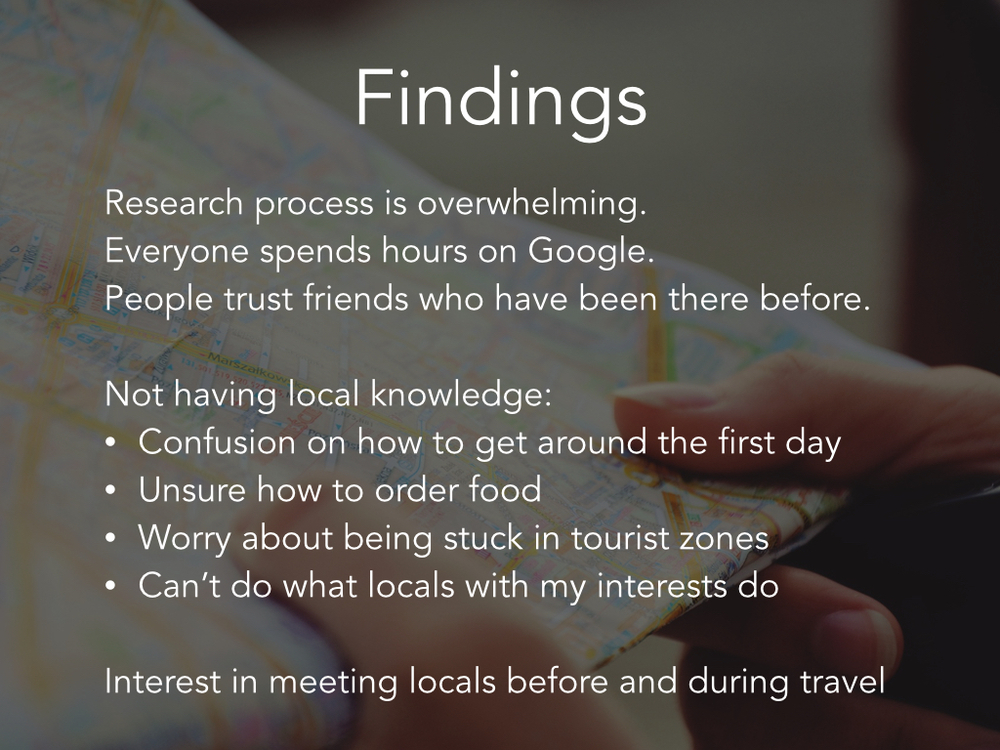
“Bottom-up processing” is a term used to describe how the human nervous system detects signals and salience, but has not yet begun to extrapolate meaning from the data. After the senses gather and roughly organize the data, the brain begins to examine the information, which provides a meaningful interpretation of what is being sensed. This interpretation is aided by prior knowledge and is known as “top-down processing”. The prior knowledge that enables humans to understand a stimulus event is based on past experience that is stored in long-term memory (Wickens, Lee, Liu, & Becker, 2004, pp. 121, 125). The human brain can perform top-down processing quickly and effectively because it is highly organized, interconnected, and constantly evolving. Humans use conceptual structures to guide cognitive processes. Understanding a person’s mental models enable designers to predict how a person will interact with a product that a user has used before or has never seen -- this paper will examine the mental model of a person using a first-generation iPod for the first time.


Types of Conceptual Models


Humans want to understand everything, which leads us to look for causes of events and properties of objects so that we can form explanations. When we find a cause-and-effect chain or a list of properties that makes sense, we store them as a conceptual model for understanding future events or objects. These conceptual models are essential to understanding our experiences, predicting the outcomes of our actions, and handling unexpected occurrences (Norman, 2013, p. 57). Semantic knowledge is knowledge of the basic meaning of things, so human knowledge is organized into semantic networks where related pieces of information share related nodes and sections of the network (Wickens et al., 2004, p. 136).

A schema is one type of conceptual structure which makes it possible to identify objects and events (D’Andrade, 1992, p. 28). Simply stated, a schema is “a general knowledge structure used for understanding” (An, 2013). Schemas are stored in long-term memory as organized collections that are quickly accessible and flexible in application (Kleider, Pezdek, Goldinger, & Kirk, 2008). The general cognitive framework of a schema provides structure and meaning to social situations and provides a guide for interpreting information, actions, and expectations (Gioia & Poole, 1984).

Schemas about events are known as scripts (Kleider et al., 2008). Scripts are the most behaviorally oriented schemas, and are mental representations of sequences and events (Sims & Lorenzi, 1992, p.237). Script behaviors and sequences are appropriate for specific situations, ranging from the tasks required to tie one’s shoes to the expected “performances” in social situations, such as going to a restaurant, attending lectures, or visiting doctors (Gioia & Poole, 1984). Scripted behavior can be performed unconsciously, although active cognition is required during script development or when a person encounters unconventional situations (Gioia & Poole, 1984).

Mental models are schemas about equipment or systems (Wickens et al., 2004, p. 137). Mental models describe system features and assist in controlling and understanding a system. Mental models can begin as incomplete, inaccurate, and unstable, but become richer as a user gains experience interacting with a system (Thatcher & Greyling, 1998).


Highly Organized


Semantic networks, schema, scripts, and mental models are highly organized, and schemas are organized within a hierarchy (D’Andrade, 1992, p. 30). The conceptual systems and mental models in the mind are extensive, distributed throughout the brain, and organized categorically (Barsalou, 2008). Semantic networks have much in common with databases or file cabinets, where items are stored near related information that are then linked to other groups of associated information (Wickens et al., 2004, p. 136). Conceptual systems categorize settings, events, objects, agents, actions, and mental states (Barsalou, 2008). Mental models categorize information to create distinct sets of possibilities based on what a person believes to be true (Johnson-Laird, 2013).


Interconnected


The power of human mind is not in its capacity but in its flexibility -- most new concepts are made by assimilating minor differences into existing knowledge (Ware, 2012, p. 386). The conceptual system includes knowledge about all aspects of experience, including settings, events, objects, agents, actions, affective states, and mental states (Barsalou, 2008). Prior knowledge facilitates the processing of new incoming information because it provides a structure into which the new information can be integrated (Brod, Werkle-Bergner, & Shing, 2013).

The mind groups or “chunks” large numbers of attributes into a single gestalt. For example the configurational attribute of “dogginess” is a configuration of many individual recoded attributes, such as nose, tail, fur, and bark. A collie is a kind of dog, so a collie inherits all of the attributes included in chunked quality “dogginess” (D’Andrade, 1993, p. 93). The networked nature of prior knowledge means that once a concept is activated, then other related concepts become partially activated, or primed (Ware, 2012, p.386). The strongly interconnected pattern of elements can be activated with minimal input  (D’Andrade, 1992, p. 29), and conceptual systems generate anticipatory inferences (Barsalou, 2008).


Constantly Evolving


The brain is not like a camera that captures and collects holistic images. Instead the conceptual system is a collection of category knowledge that contains a powerful attentional system that focuses on individual components of experience and establishes categorical knowledge about them (Barsalou, 2003, 2008). New information is consolidated into long-term memory when the mind actively processes the new information to integrate it with existing knowledge (Craik, 2002). Whenever the mind focuses selective attention consistently on components of experience, the mind develops knowledge of the category (Barsalou, 2003). Knowledge is constantly being accumulated because the mind is constantly detecting regularities in the environment (Brod et al., 2013). For example, when the mind focuses on a blue patch of color, the information is extracted and stored with previous memories of blue, which adds to the categorical knowledge of “blue.” Over time, the mind accumulates a myriad of memories in a similar manner for objects, events, locations, times, roles, and so forth (Barsalou, 2003). The mind develops complex concepts such as relations (e.g., above), physical events (e.g., carry), and social events (e.g., convince) through the same mechanism (Barsalou, 2008).


Categorization


Humans categorize all objects and events we encounter in the world. Categorization is essential for survival -- if you mistake a stove for a chair or tiger for a housecat, the consequence may be disastrous. Because of this survival need, the categorization of objects and events takes places unconsciously (Vecses & Koller, 2006, p. 17). As people process members of a category, they store a memory of each categorization event. When encountering future objects or events, people retrieve these memories, assess their similarity, and include the entity in the category if there is sufficient similarity (Barsalou, 1998). Categorical knowledge provides rich inferences that enable expertise about the world — rather than starting from scratch when interacting with something, a person can benefit from knowledge of previous category members (Barsalou, 2003).

Three models for categorizing objects and events are the exemplar, prototype, and classical models. In the exemplar model, people’s representation of an object is a loose collection of exemplar memories, and to categorize an entity, a person attempts to find the exemplar memory that is most similar to the entity. In the prototype model, a person extracts properties that are representative of a category’s exemplars and integrates them into a category prototype. In the classical model, an entity must meet certain rules to qualify for membership (Barsalou, 1992, pp. 26-29).


Affordances


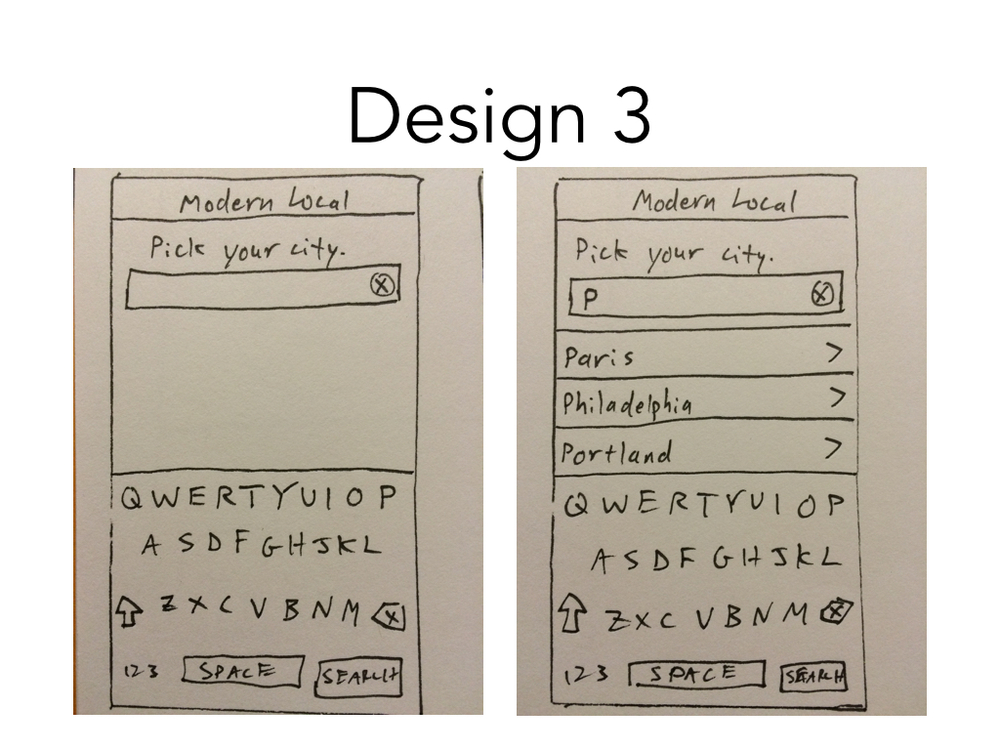
People interpret and categorize entities to determine if they can operate on their environment (Ware, 2012, p. 18). People perceive not only features of objects, but also information about how to interact with them (Apel, Cangelosi, Ellis, Goslin, & Fischer, 2012). The term “affordances” describes perceived possibilities for action offered by objects. A cup, for example can be used for drinking or it can be used for catching a spider — a cup affords both of these actions (Humphreys, 2001). Affordance is not a property of an object, but a relationship that depends on the object, the environment, and the agent’s mental models (Norman, 2013, p. 11).


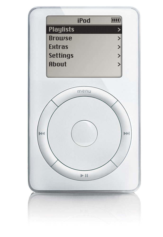
Case Study - First Generation iPod


Apple released the iPod on Oct 23, 2001. Before the iPod, the mass consumer market was familiar with portable music players in the form of cassette players, CD players, and MP3 players (images in Appendix 1). Sony’s Walkman cassette player was released in 1980 and featured buttons for play, stop, fast-forward, rewind, open, and a slider for volume. Sony introduced the Discman in 1984 and it featured buttons for play/pause, next song, previous song, stop, play mode, repeat/enter, open, and a slider for volume. The first commercially successful MP3 player was the Diamond Rio introduced in 1998, which featured buttons for play/pause, stop, next track, previous track, volume up, volume down, random, repeat, A-B, and hold. 

 
ipod
 

The iPod has buttons for play/pause, next song, previous song, menu, a scroll wheel, and an unlabeled button in the center of the wheel that means “select” or “enter.” After clicking “menu,” a user scrolls the wheel clockwise or counterclockwise to navigate up or down the menu, respectively, and clicks the unlabeled “enter” button in the center to choose a line. While a song is playing, the user scrolls the wheel to turn volume up or down.

Jakob Nielsen’s “Law of Internet User Experience” states that users spend most of their time on websites other than yours, and people expect websites to act alike because their mental model is based on what they think they know about a system (Nielsen, 2010). A designer can replace “websites” with “products” and infer that they must determine what a user knows and then design their product to mirror that knowledge. This will prevent the user from “thrashing about” the product randomly pushing buttons, which increases anxiety.

First-time iPod users expected to see buttons that are common across portable music players, such as play, pause/stop, forward, and backward. These functions have always been buttons in other music players and are frequently used, so keeping them physical buttons was designing within a known mental model. Apple mirrors the common mental model by offering physical play/pause, next, and previous buttons. Volume has been a slider, scroll wheel, or set of buttons on previous players, so while users expect to be able to change the volume, there was no set model for how to manipulate volume. The MP3 player category introduced the new functionality of being able to store individual songs from many albums or artists, rather than playing a single album on a cassette or CD. A first-time user has no mental model for how to navigate through menu options or change the volume in the iPod.

The menu button, scroll wheel, and select button are new to the iPod, but Apple used signifiers effectively to help first-time users understand affordances and map a model of how to use the iPod. Where affordances show what actions are possible, signifiers show where the action should take place. To be effective, affordances and anti-affordances have to be discoverable and perceivable, which these all are (Norman, 2013, pp. 11, 14). The menu button is prominent at the top of the wheel and is a natural place to begin exploration. The first click of “menu” shows users the options (artists, albums, etc.). When the user is further into the menu or playing a song, clicking “menu” brings up the most recent menu screen, and subsequent clicks of “menu” navigate up the hierarchy until the user reaches the home screen. At the home screen, clicking “menu” causes no effect, which is an anti-affordance that informs the user that this is the top-level folder. The five buttons at top, right, bottom, left, and center provide haptic feedback by clicking in and out upon being pressed. This haptic feedback provides clear signals to the user that the button has been pressed, so they will not question if they performed the action correctly.

While the menu button has an obvious purpose, using the scroll wheel to navigate up and down the menu is not obvious because an unlabeled circle does not signify scrolling in a clockwise or counterclockwise pattern. Because the center button is unlabeled, its purpose is unclear, although it is raised from the scroll wheel, which is a common design pattern for buttons, and helps communicate to the user that it affords pressing. The user must either see a person scroll the wheel in real-life or advertisements, or stumble across this discovery on their own. The exploration that leads to discovery is likely because, according to the Fogg Behavioral Model, motivation and ability trade off, and the motivation to use this device is high enough to overcome the cost of clicking a few buttons to explore the reaction (Fogg, 2009). Apple’s minimalist design limits the possibilities for action so the user has very few choices of what to click, and the instant feedback helps to rapidly create mental models of what is possible for first-time users.


Appendix 1


Sony Walkman cassette player, 1980

walkman

Sony Discman CD player, 1984

 
discman
 

Diamond Rio MP3 player, 1998

diamond rio

Apple iPod, 2001

 
ipod
 

Bibliography


An, S. (2013). Schema theory in reading. Theory and Practice in Language Studies, 3(1), 130-134.

Apel, J. K., Cangelosi, A., Ellis, R., Goslin, J., & Fischer, M. H. (2012). Object affordance influences instruction span.Experimental Brain Research, 223(2), 199-206. doi:http://dx.doi.org/10.1007/s00221-012-3251-0

Barsalou, L.W., (1992). Cognitive Psychology: An Overview for Cognitive Scientists. Hillsdale, NJ: Lawrence Erlbaum Associates.

Barsalou, L.W. (2003). Situated simulation in the human conceptual system. Language and Cognitive Processes. 8(516), 513-562.

Barsalou, L.W. (2008). Cognitive and neural contributions to understanding the conceptual system. Current Directions in Psychological Science. 17(2), 91 – 95.

Barsalou, L.W., Huttenlocher, J., & Lamberts, K. (1998). Basing categorization on individuals and events. Cognitive Psychology. 36(3), 203-272. doi: 10.1006/cogp.1998.0687

Brod, G. Werkle-Bergner, M., & Shing, Y.L. (2013). The influence of prior knowledge on memory: A developmental cognitive neuroscience perspective. Frontiers in Behavioral Neuroscience. 7, 139. doi: 10.3389/fnbeh.2013.00139

Craik, F. I. (2002). Levels of processing: Past, present ... and future?. Memory, 10(5/6), 305-318. doi:10.1080/09658210244000135

D'Andrade, R. G. (1992). Schemas and motivation. In R. G. D'Andrade and C. Strauss (Eds.) Human Motives and Cultural Models. Cambridge: Cambridge University Press.

D'Andrade, R. G. (1993). The Development of Cognitive Anthropology. Cambridge: Cambridge University Press.

Fogg, B.J. (2009). A Behavioral Model for Persuasive Design. Retrieved from http://bjfogg.com/fbm_files/page4_1.pdf

Gioia, D.A., & Poole, P.P. (1984). Scripts in Organizational Behavior. The Academy of Management Review. 9(3), 449-459.

Humphrey's, G. (2001). Objects, affordances...action! Psychologist, 14, 408. Retrieved from http://search.proquest.com.ezproxy.babson.edu/docview/211831140?accountid=36796

Johnson-Laird, P.N. (2013). Mental models and cognitive change. Journal of Cognitive Psychology. 25(2), 131-138. doi: 10.1080/20445911.2012.759935

Kleider, H. M., Pezdek, K., Goldinger, S. D., & Kirk, A. (2008). Schema-driven source misattribution errors: Remembering the expected from a witnessed event. Applied Cognitive Psychology. 22(1), 1-20. doi:10.1002/acp.1361

Nielsen, J. (2010, Oct 18). Mental Models. Retrieved from http://www.nngroup.com/articles/mental-models/

Norman, D. (2013). The Design of Everyday Things Revised and Expanded Edition. New York: Basic Books.

Sims, H. P., Jr., & Lorenzi, P. (1992). The new leadership paradigm: Social learning and cognition in organizations. Newbury Park, CA: Sage.

Thatcher, A., & Greyling, M. (1998). Mental models of the internet. International Journal of Industrial Ergonomics. 22(4-5), 299-305. doi: 10.1016/S0169-8141(97)00081-4

Vecses, Z., & Koller, B. (2006). Language, mind, and culture: A practical introduction. New York: Oxford.

Ware, C. (2012) Information Visualization, Third Edition: Perception for Design (Interactive Technologies). Waltham, MA: Morgan Kaufmann.

Wickens, C., Lee, J.D., Liu, Y., & Gordon, S.E. (2004). An introduction to human factors engineering (2nd ed.). Upper Saddle River, N.J.: Pearson Prentice Hall.


What I'm reading — December 2014

This fall I took a Product Design and Development class at Babson. Our textbook for the course was Designing for Growth by Jeanne Liedtka and Tom Ogilvie. The book is a design thinking primer for MBAs and guided our semester-long design project. The design process asks four questions: "What is? What if? What wows? What works?"

You can read a preview of the first few chapters here. The graph below comes from chapter two.

Bonus: I'm also listening to a few podcasts. They are "A Responsive Web Design Podcast" and "The Dirt" by Fresh Tilled Soil.